
By using our website, you agree to the use of cookies as described in our Cookie Policy
Blog
Choosing the Right Paint for Each Room in Your House
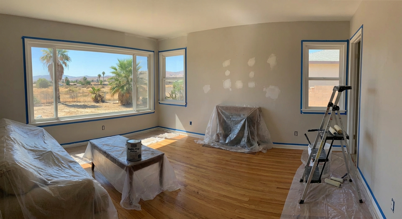
Pick the wrong paint, and you’ll notice every time you walk in. Color and finish aren’t just about looks. They decide if a room feels right, hides wear, or stands up to daily messes. Each space in a house has its own needs. Some walls need to handle fingerprints and scrubbing. Others need to look smooth and bright, even in bad light. The best paint choices come from matching what the room demands, not just what looks good on a sample card. When clients ask for guidance, we always start by considering how each room is used and what it needs to endure.
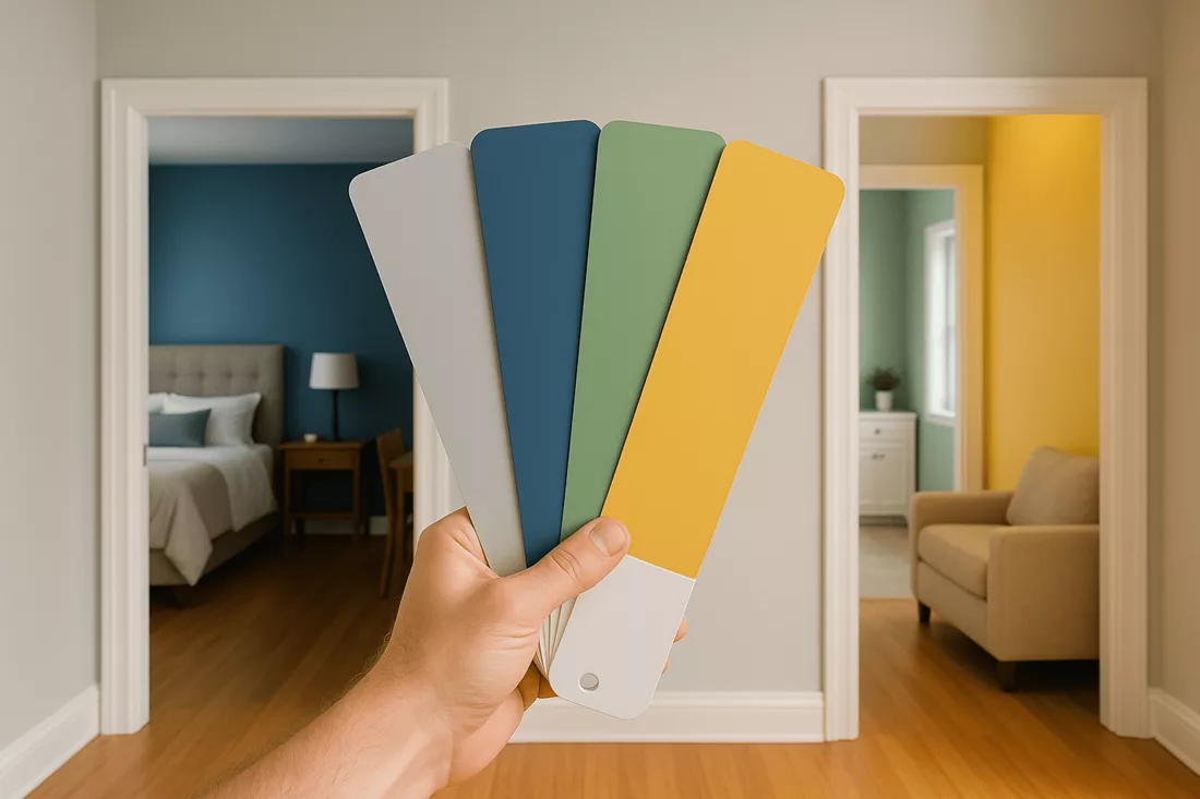
Color Sets the Mood
Walk into a room painted in deep terracotta or gold. The space feels warm. Family rooms and dens need that comfort. These colors pull people in, make them want to stay. Bedrooms and offices need something else. Cool blues and greens calm the mind. They help people focus, sleep, or just breathe easier. Neutral grays and taupes don’t fight for attention. They let furniture and art do the talking. They work in any room, any style. Want a little punch? One bold accent wall does the job. It adds energy without taking over. Natural whites do something different. They catch every bit of daylight, making small rooms feel bigger and brighter.
- Terracotta and gold: Cozy, inviting, best for family spaces
- Blues and greens: Calm, focused, ideal for bedrooms and offices
- Grays and taupes: Flexible, timeless, fit anywhere
- Accent walls: Add personality, keep balance
- Natural whites: Maximize light, open up tight spaces
Color isn’t just about looks. It changes how a room feels and works. That’s why our residential painting skill matters. We see what works in real homes, not just on color cards.
Finish Makes or Breaks a Room
Paint finish gets ignored until it fails. Kitchens and hallways take a beating. Greasy hands, muddy shoes, kids with markers. Flat paint won’t last here. It stains, it scuffs, it looks tired fast. Semi-gloss and satin finishes shrug off dirt. Wipe them down, and they look new again. These finishes also bounce a little light, keeping busy spaces bright. For commercial painting projects, the demands go up. Industrial-grade finishes handle crowds, carts, and constant cleaning. They don’t fade or chip under pressure.
Bedrooms and living rooms need something softer. Flat or eggshell finishes hide old nail holes and patched cracks. They give walls a smooth, even look. No glare, no shine. Just a clean backdrop for everything else. These finishes work well in tenant improvement projects too. They make spaces look polished and professional, even when the walls aren’t perfect.
- Semi-gloss and satin: Tough, easy to clean, best for high-traffic areas
- Flat and eggshell: Hide flaws, look refined, perfect for quiet spaces
- Industrial-grade: Built for heavy use, stay sharp in commercial settings
Light Changes Everything
Natural light can make or break a paint color. South-facing rooms soak up sun. They can handle deep, rich shades without feeling dark. North-facing rooms get less light. Pale colors work better here. They keep the space from feeling cold or gloomy. East and west rooms shift all day. Morning sun, afternoon shadows. Colors look different by the hour. The right paint choice keeps these rooms balanced, no matter the time. Our portfolio of work shows what happens when color and light work together. The difference is clear in every photo.
- South-facing: Go bold, the light can handle it
- North-facing: Stick with lighter shades for warmth
- East/west: Test colors at different times of day
Rooms Need to Flow
One room painted navy, the next in bright yellow. Jarring. Good design moves from space to space without a jolt. That doesn’t mean every wall needs the same color. Pick a palette that connects the rooms. Use different shades of the same color, or colors that play well together. This keeps the house feeling unified, not chaotic. The right palette ties together open floor plans, hallways, and even small nooks. See how a smart palette pulls everything together in our interior design vision gallery. At Watson Painting Corporation, we help homeowners create that sense of flow with thoughtful color planning and expert application.
- Choose a base color for the main spaces
- Add accent colors in smaller rooms or on feature walls
- Repeat trim and ceiling colors for consistency
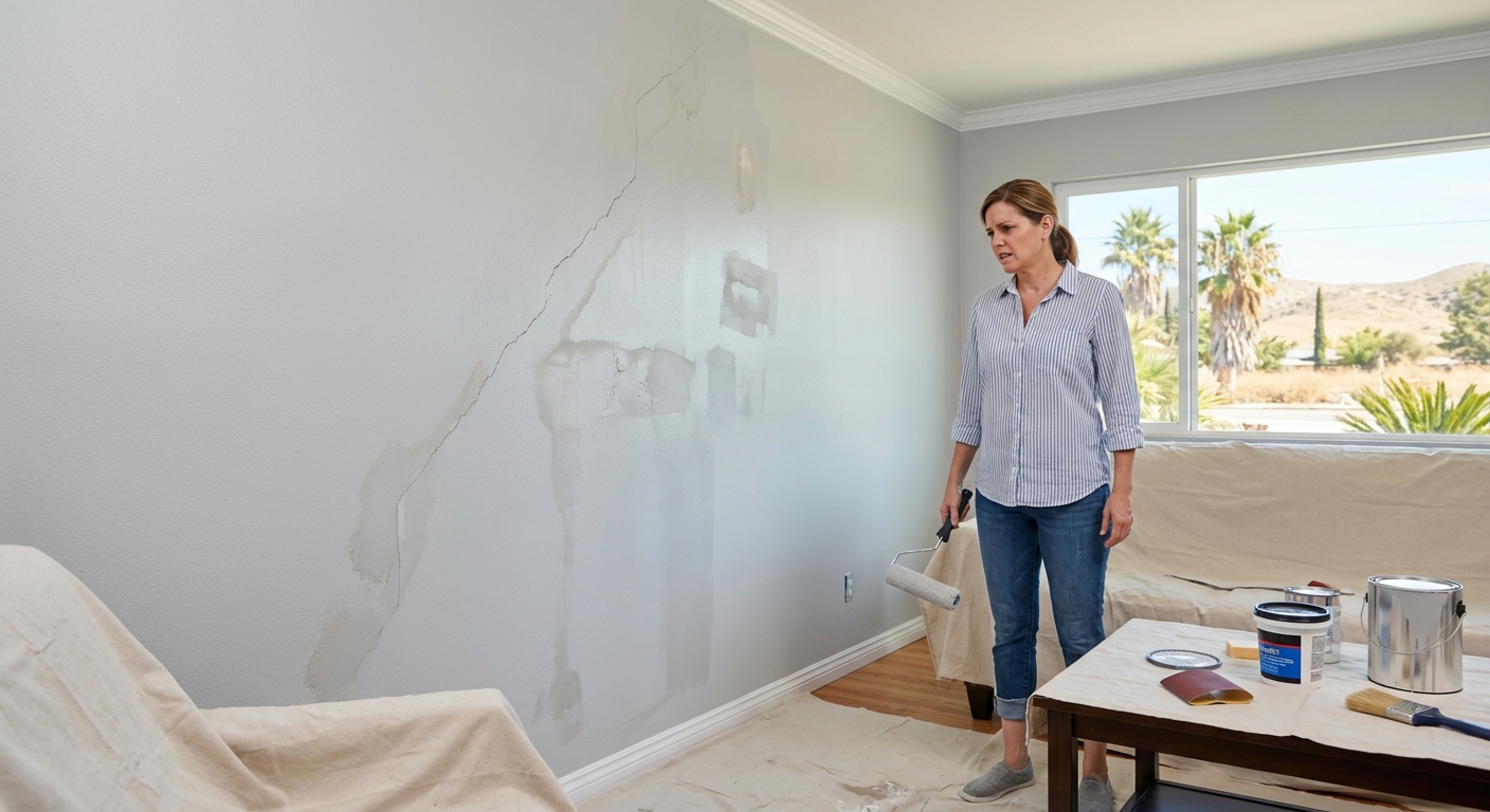
Paint Mistakes That Cost Time and Money
Cheap paint shows every brush mark. It peels, it fades, it stains. Wrong finish? Scrubbing ruins the wall. Wrong color? The room never feels right. Skipping primer leads to patchy, uneven results. Using the same paint everywhere wastes money and effort. Each room needs its own plan. The right paint saves time, looks better, and lasts longer. The wrong choice means repainting sooner than you want.
- Low-quality paint: More coats, less coverage, faster wear
- Wrong finish: Stains, scuffs, and cleaning headaches
- Poor color choice: Uncomfortable rooms, wasted effort
- No primer: Uneven color, poor adhesion
Transform Your Space with Expert Paint Selection
Watson Painting Corporation brings decades of color skill to every Riverside project. Call us at 951-785-6765 or schedule an appointment to find the perfect paint solutions for your home.
‹ Back
Recent Posts
-

-
Can You Paint Over Damaged Walls in Your Riverside Home?
June 15, 2026
-
-
-